AETHEL: THE ART OF LUXURY SHOPPING
Project Overview: AETHEL
Role: UI/UX Designer.
Objective: The goal was to create a seamless shopping experience that helps users discover and explore products while maintaining the feeling of a premium luxury brand
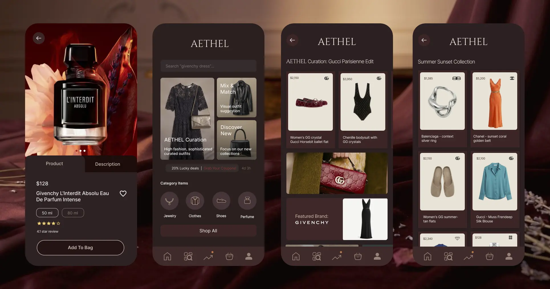
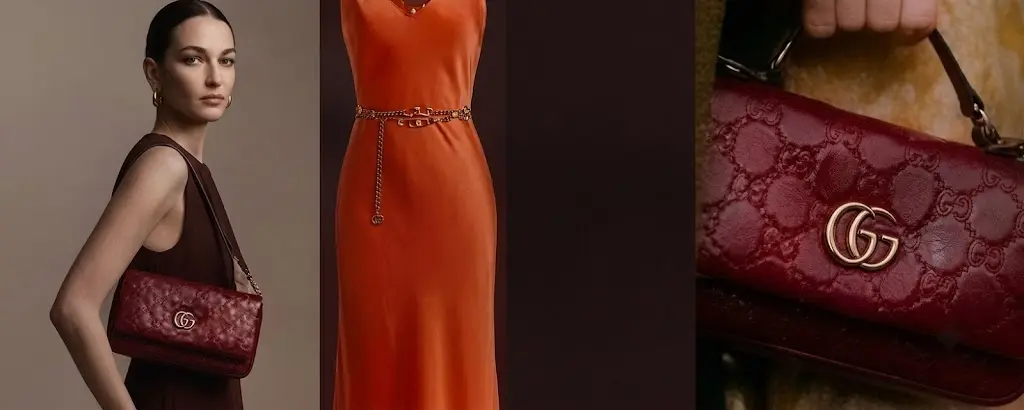
Design Philosophy: Focused on a "soft luxury" aesthetic, utilizing a minimalist layout, muted color palettes, and high-contrast typography to emphasize exclusivity and class.
1. Challenge & Goals
Challenge: High-fashion e-commerce platforms often prioritize quantity over quality, leading to overwhelming interfaces that detract from the exclusivity of the brand.
Goals: To create a 'soft luxury' mobile experience where the visual storytelling remains the primary focus. The goal was to build a cohesive visual system that bridges the gap between editorial-style browsing and efficient, high-end mobile commerce for luxury shopping specifically.
2. Market Analysis
I analyzed existing luxury fashion apps to identify common pitfalls in mobile layout design. My focus was on how top-tier brands balance dense product grids with white space, and how they handle CTA placement to maintain a premium feel without sacrificing utility.
A. The "Soft Luxury" Gap: There is an opportunity for a platform that balances a refined, minimalist aesthetic with intuitive mobile-first patterns, specifically by using whitespace and controlled typography to elevate the perceived value of items.
B. Inconsistent Visual Hierarchy: Competitors frequently struggle to balance editorial content with functional navigation, leading to a fragmented user experience where the brand identity feels disconnected from the shopping utility.
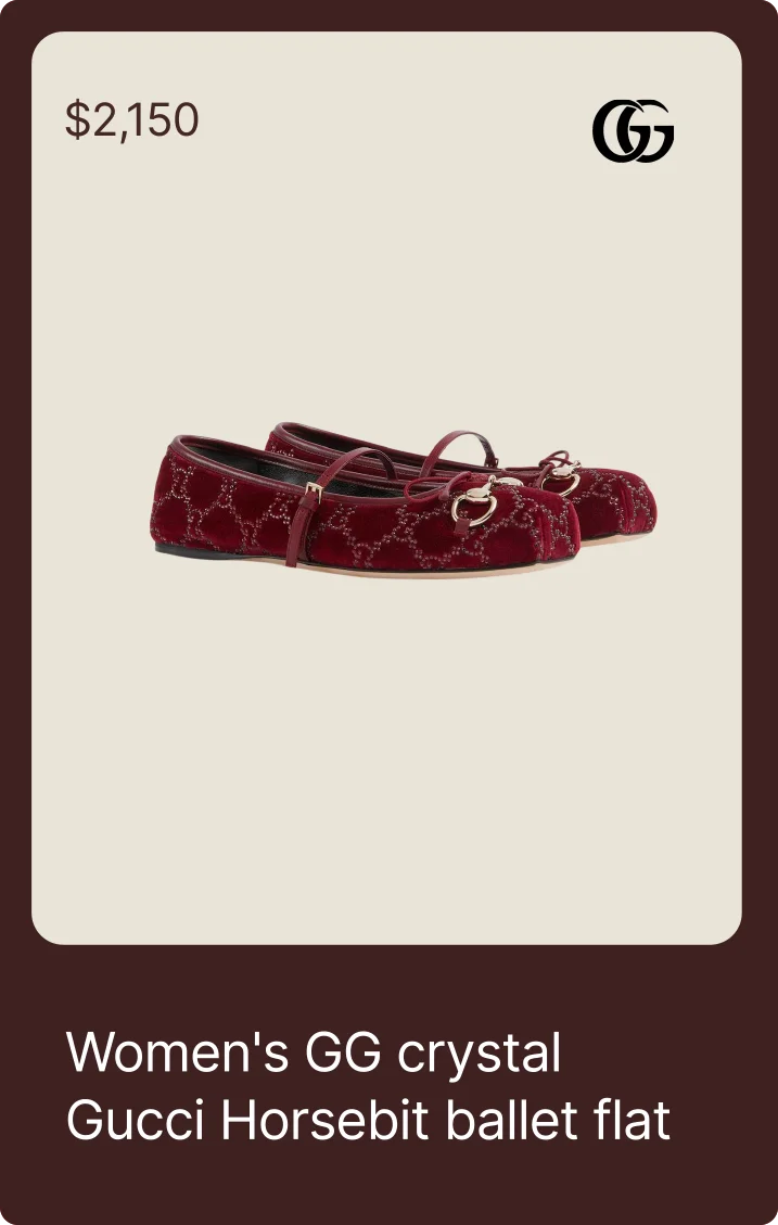
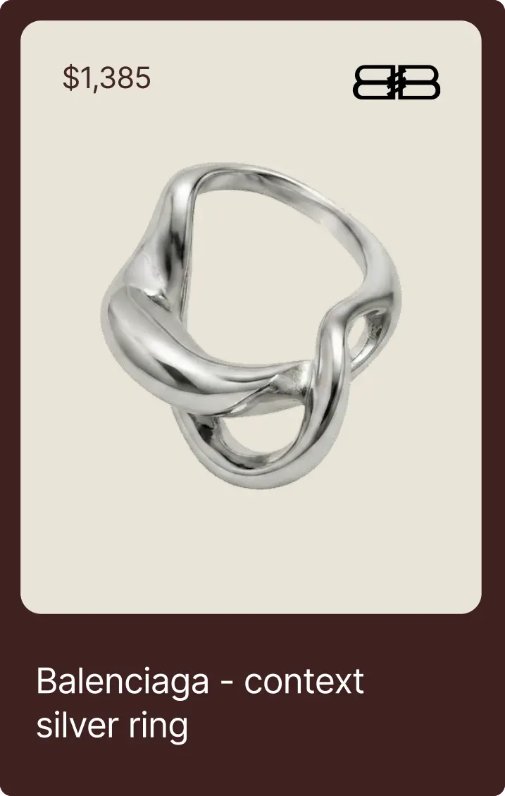
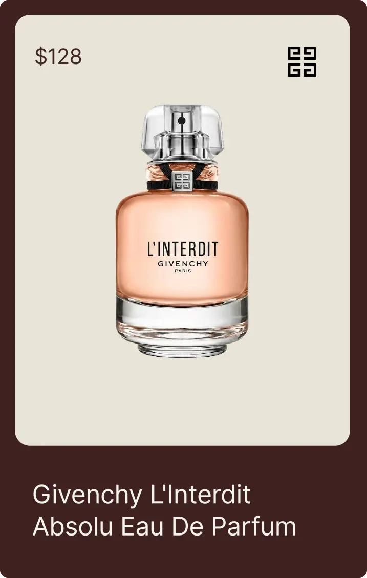
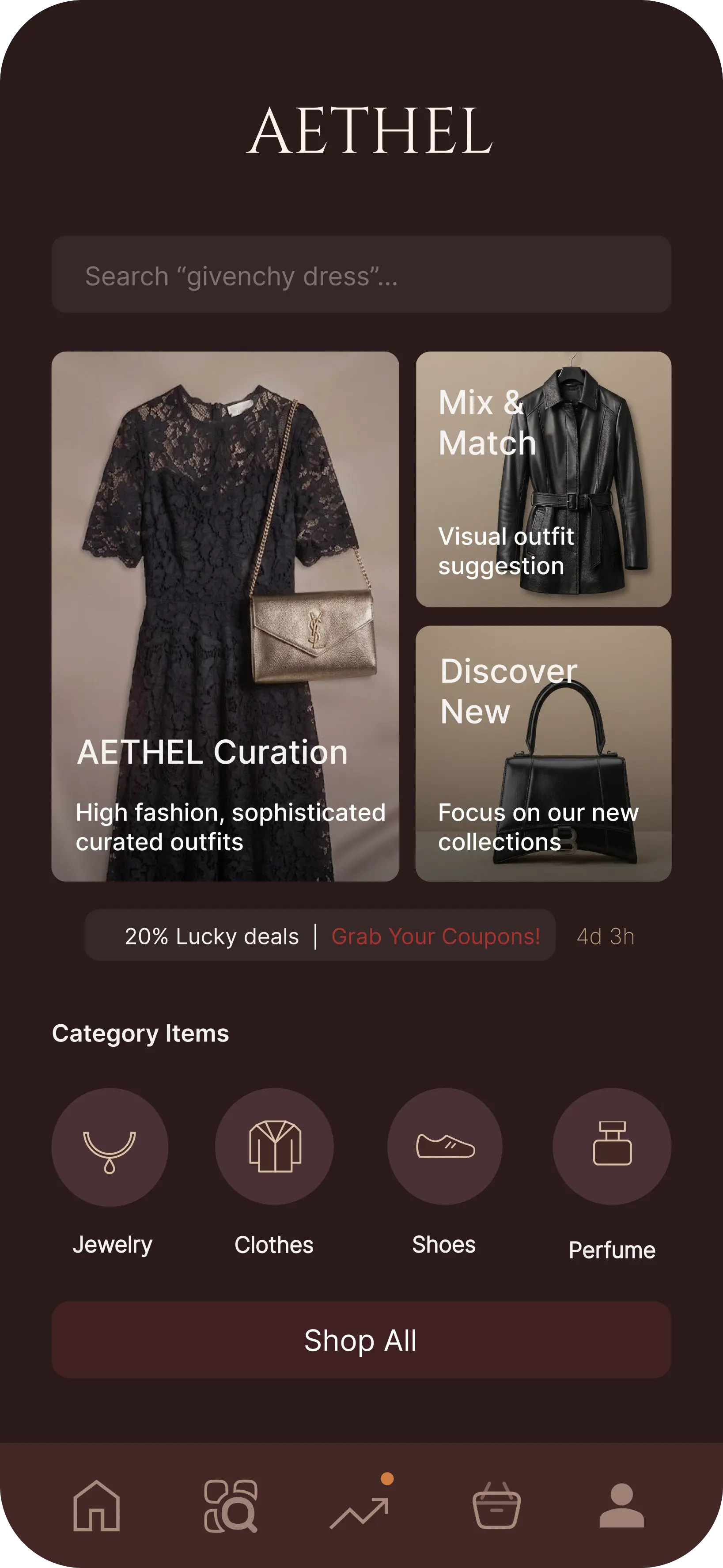
Visual HierarchyA clear, tiered layout guides the user's eye from the brand identity to product details, ensuring the most essential information is prioritized for seamless navigation.
Strategic Use of WhitespaceGenerous negative space surrounds each high-fashion asset, allowing products to breathe and reinforcing the premium, exclusive nature of the brand.
Consistency & AlignmentA strict grid system maintains perfect order across all screens, creating a reliable, high-end shopping experience that feels intentional and polished.
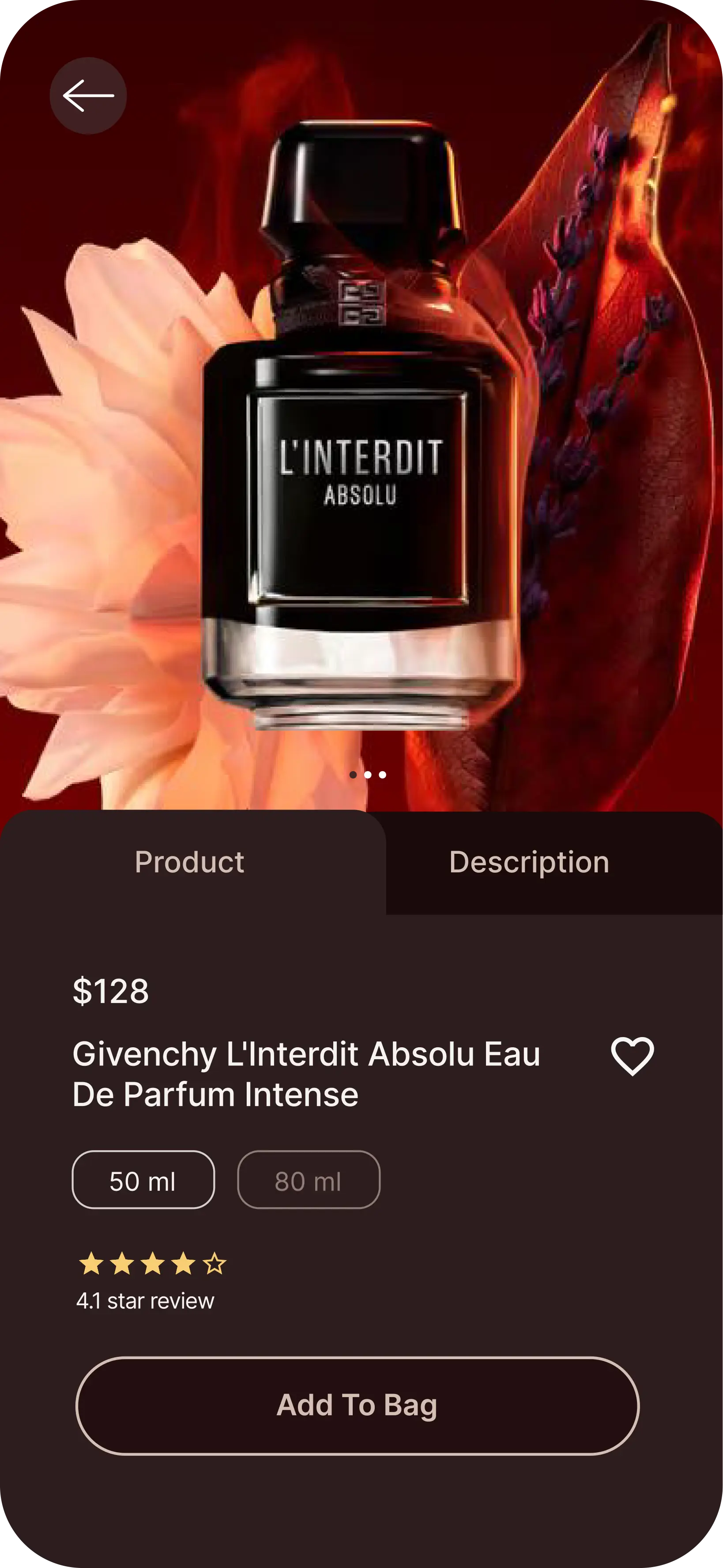
Color Contrast & MoodThe dark-toned palette evokes sophistication and luxury, while carefully balanced light-colored typography ensures that primary calls to action remain accessible and legible.
Proximity & GroupingRelated elements, such as pricing and action buttons, are grouped together to reduce cognitive load, helping users intuitively understand the interface at a glance.
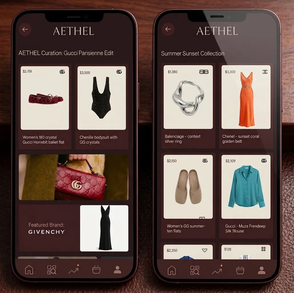
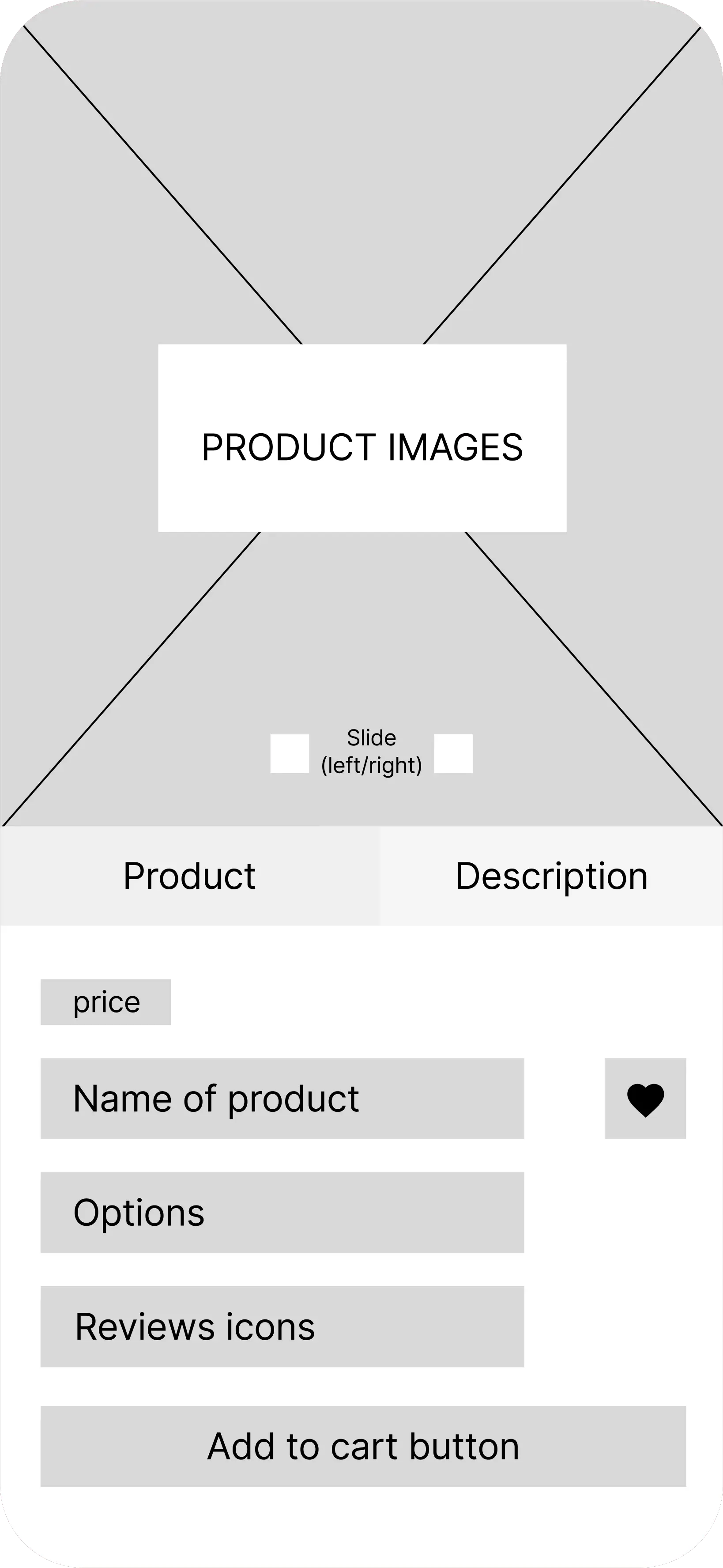
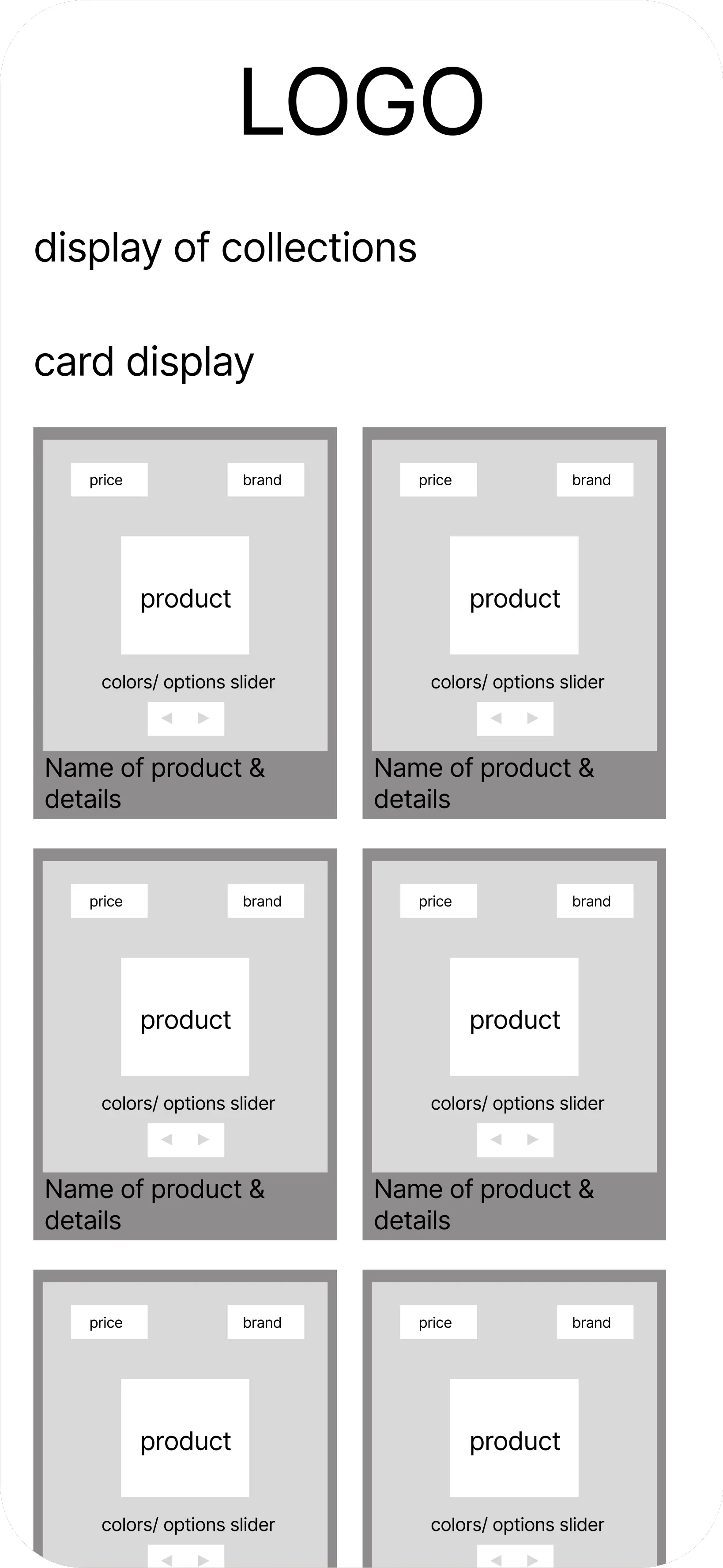
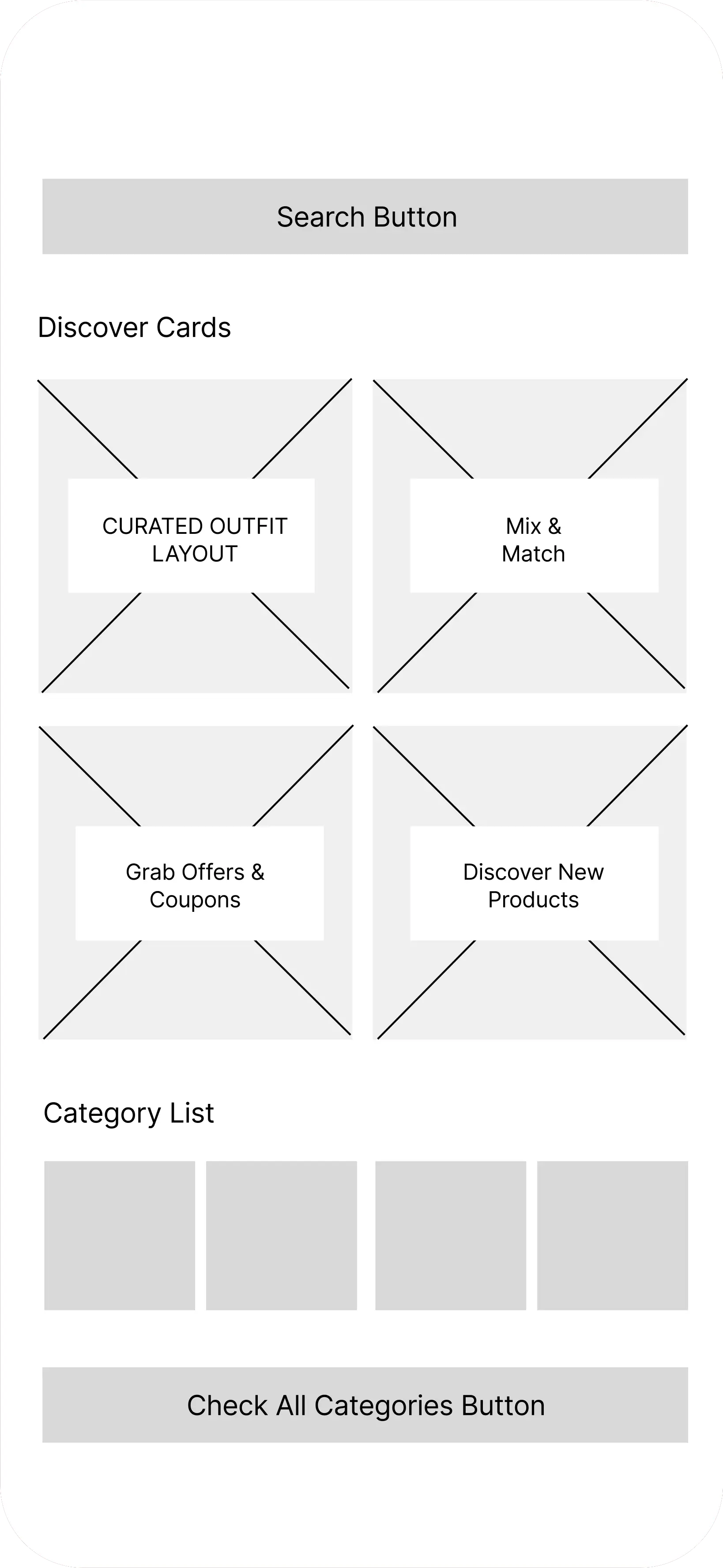
After defining the structure and core user experience, I created initial wireframes to explore the layout, content hierarchy, and overall navigation flow.
Through iteration, I refined the interface by improving information organization, visual balance, and the clarity of key elements. The final wireframes focused on creating a smoother browsing experience while maintaining Aethel's premium and elegant identity.
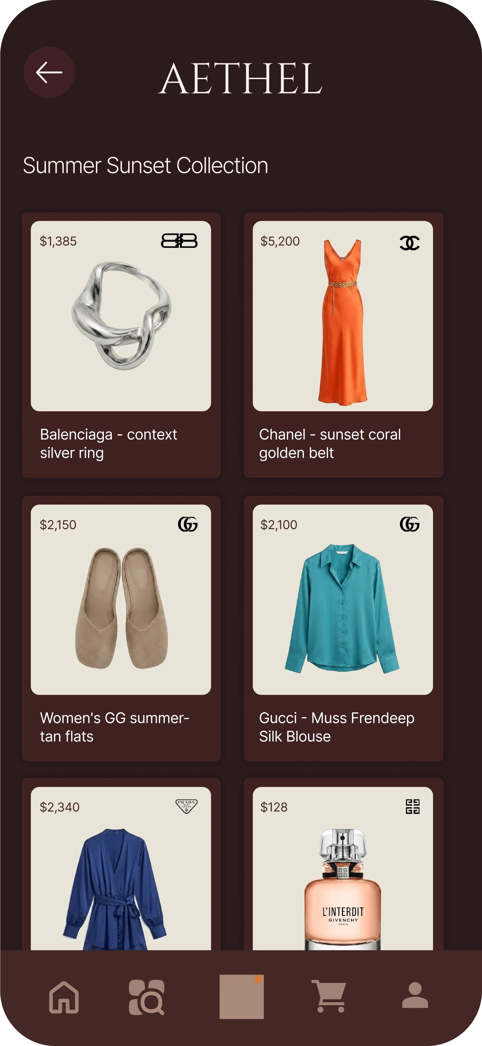
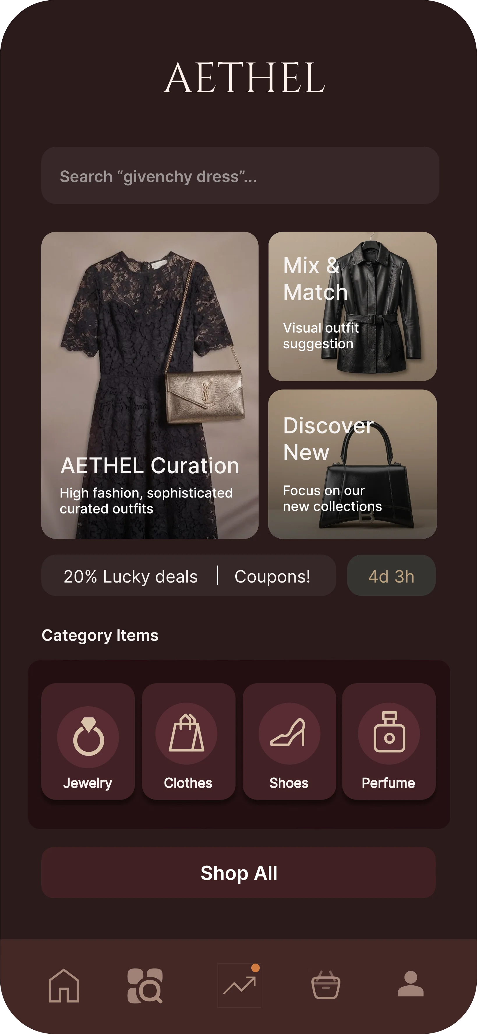
To create a cohesive experience, I developed a visual system that reflects Aethel's luxury positioning while keeping the interface clean and easy to navigate.
Color Palette
Deep Burgundy — #2A1B1BUsed for main backgrounds to create a sophisticated and premium atmosphere.
Off-White — #EAE3D5Applied to product cards and search areas to provide contrast and maintain readability.
Champagne — #C5A880Used for typography and icons to add subtle luxury accents and reinforce the brand identity.
Typography
Logo
Font: Cinzel Regular
Cinzel Regular
AETHEL
Chosen for the Aethel logo to communicate elegance, heritage, and a high-end aesthetic.
Interface Text
Font: Inter Regular
a b c d e f g h i j k l m n o p q r s t u v w x y z
Used for product information and interface elements to ensure readability and provide a clean, modern user experience across screens.
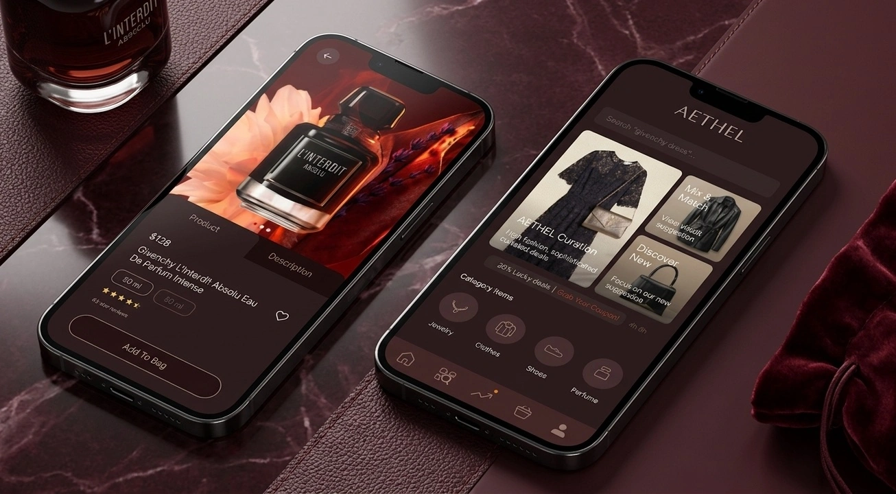
The final design combines a refined visual identity with a structured user interface, balancing a luxury brand feel with usability and clarity.